This article was automatically translated from the original Turkish version.
+2 More
Pareto Chart
Definition(s) | Bar Chart and Cumulative Percentage Curve Ranked by Importance | ||||||||
|---|---|---|---|---|---|---|---|---|---|
Purpose(s) | Prioritization by Identifying the Most Important Minority Causes | ||||||||
Basic Principle | Pareto Principle (80/20 Rule) | ||||||||
Fields | Quality, Production, Health, Project Management, Service | ||||||||
Founder(s) | Vilfredo Pareto Joseph M. Juran | ||||||||
Technique | Project Management Tool and Technique | ||||||||
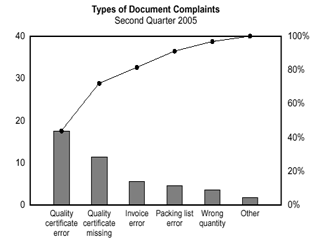
Pareto chart (Pareto diagram) is a bar graph in which data are ordered by their relative importance. The lengths of the bars represent the frequency or cost of each problem or cause and are arranged in descending order with the longest bar on the left. Above the bars a curve indicates the cumulative percentage of these values.

Pareto Charts and the 80-20 Rule (NSW)
Developed in the 20th century within the framework of Vilfredo Pareto’s “vital few – trivial many” principle, the Pareto chart emerged from Pareto’s 1906 observation that 80 percent of land in Italy was owned by 20 percent of the population and that this distribution could be generalized. In many systems the majority of outcomes result from a small number of causes. This principle, known as the 80/20 rule, was adapted to quality management by Joseph Juran and formed the foundation of the Pareto chart. Juran introduced the cumulative percentage curve to the bar graph enabling easy identification of the critical factors the “vital few” and initiated its widespread use.
The Pareto chart enables rapid identification of the most common or most impactful problems within a complex data set. This allows resources in quality improvement or process enhancement initiatives to be prioritized toward the few factors that constitute the “vital few.” The chart visually reveals the frequency distribution of problems or error types making the most frequent causes immediately apparent and highlighting their contribution to the total problem volume such as the 80 percent threshold. This reduces unnecessary effort and cost. According to ASQ the Pareto chart is a fundamental tool for analyzing problem frequency and helps teams focus on the issues that will generate the greatest impact. Pareto analysis is a technique that facilitates decision making and efficient use of time in problem solving by identifying the “vital few” contributors to an issue.
The Pareto chart is used in many fields including quality management process improvement and manufacturing. For example in the analysis of production defects or defect types it can determine which kinds of defects account for the majority of overall problems. In process improvement projects such as Six Sigma’s DMAIC methodology Pareto charts are among the primary tools for identifying the most critical variables. In the healthcare sector Pareto charts are used in patient safety and clinical error analysis for instance to identify the “vital few” causes of medication errors. In public administration or the service sector they help classify and prioritize public complaints and feedback. In IT and software development they are useful for analyzing error logs. In commercial applications similar 80/20 relationships are observed in customer complaints or sales data for example 80 percent of customer complaints typically originate from 20 percent of customers. These examples demonstrate the utility of the Pareto chart in prioritizing problems across a broad spectrum of industries.
The Pareto chart is recognized as one of the fundamental tools in total quality management and process improvement methodologies. ASQ identifies the Pareto chart as one of the seven basic quality control tools. The Six Sigma methodology also frequently employs Pareto analysis because improvement teams rely on these charts to identify the “vital few” causes of a problem. While the ISO 9001:2015 standard does not explicitly require any specific tool it emphasizes principles of continual improvement and data driven decision making. Within this framework the Pareto chart is one of the recommended methods for data analysis in QMS. For example in ISO compliant systems Pareto analysis is used to identify the most significant problems during process improvement and corrective action planning.
A Pareto chart is typically constructed using the following steps:
Although a powerful analytical tool the Pareto chart has certain limitations. First it is based on historical data and does not guarantee reliable predictions of future conditions. Second it shows only the categorical distribution of problems or causes and does not directly reveal causal relationships between causes or propose solutions. Third because Pareto analysis relies on categorical comparisons rather than quantitative statistics it does not provide statistical information such as mean or standard deviation. For these reasons the Pareto chart is typically used in conjunction with other data analysis methods and its results should be interpreted accordingly.
American Society for Quality (ASQ). "Pareto Chart." Accessed June 18, 2025. https://asq.org/quality-resources/pareto.
Beecroft, Graham D. "Process Improvement Using Pareto Analysis." Quality Progress 32, no. 4 (1999): 90–94.
Besterfield, Dale H. Quality Control. 8th ed. Upper Saddle River, NJ: Prentice Hall, 2009.
Clinical Excellence Commission (CEC). "Pareto Charts." New South Wales Government. Accessed June 18, 2025. https://www.cec.health.nsw.gov.au/CEC-Academy/quality-improvement-tools/pareto-charts#:~:text=80%2F20%20Rule%20%E2%80%93%20The%20Pareto,Principle.
Garg, Varun, and Krishna Mohan Surapaneni. “Using Pareto Charts to Identify and Prioritize Key Causes of Delays in Discharge of Patients from the Postanesthesia Care Unit.” *Journal of Anaesthesiology, Clinical Pharmacology* 39, no. 2 (2023): 248–254. https://pmc.ncbi.nlm.nih.gov/articles/PMC10228985/#:~:text=unnecessary%20costs,chart%20that%20was%20used%20to.
ISO (International Organization for Standardization). ISO 9001:2015 – Quality Management Systems – Requirements. Geneva: ISO, 2015.
Juran, Joseph M. Juran on Quality by Design: The New Steps for Planning Quality into Goods and Services. New York: Free Press, 1992.
Köksal, Mustafa. “Pareto Analizi ile Kalite Problemlerinin Sınıflandırılması.” *Uluslararası Güncel Eğitim ve Sosyal Bilimler Dergisi* 2, no. 1 (2020): 35–45. Accessed June 18, 2025. https://dergipark.org.tr/tr/download/article-file/3521352.
Microsoft Support. "Pareto Grafiği Oluşturma." Accessed June 18, 2025. https://support.microsoft.com/tr-tr/office/pareto-grafi%C4%9Fi-olu%C5%9Fturma-a1512496-6dba-4743-9ab1-df5012972856.
Montgomery, Douglas C. Introduction to Statistical Quality Control. 8th ed. Hoboken, NJ: Wiley, 2020.
PMI (Project Management Institute). "Five Elements of a Process-Oriented Project." *PMI Learning Library*. Accessed June 18, 2025. https://www.pmi.org/learning/library/five-elements-process-oriented-project-6946.
Pyzdek, Thomas, and Paul A. Keller. The Six Sigma Handbook: A Complete Guide for Green Belts, Black Belts, and Managers at All Levels. 4th ed. New York: McGraw-Hill Education, 2018.
Selalmaz, Ersin, and Metin Zeyveli. “İstatistiksel Süreç Kontrolü Tekniklerinden Pareto Analizi ve Üretim Hatalarının Sınıflandırılmasında Kullanımı.” *Fırat Üniversitesi Uluslararası Disiplinlerarası Akademik Araştırmalar Dergisi* 5, no. 3 (2020): 267–274. Accessed June 18, 2025. https://dergipark.org.tr/tr/pub/fudad/issue/47155/593732.

Pareto Chart
Definition(s) | Bar Chart and Cumulative Percentage Curve Ranked by Importance | ||||||||
|---|---|---|---|---|---|---|---|---|---|
Purpose(s) | Prioritization by Identifying the Most Important Minority Causes | ||||||||
Basic Principle | Pareto Principle (80/20 Rule) | ||||||||
Fields | Quality, Production, Health, Project Management, Service | ||||||||
Founder(s) | Vilfredo Pareto Joseph M. Juran | ||||||||
Technique | Project Management Tool and Technique | ||||||||
History
Purposes and Analytical Benefits
Main Application Areas
Role in Quality Management Standards
Constructing the Chart
Limitations