


This article was automatically translated from the original Turkish version.
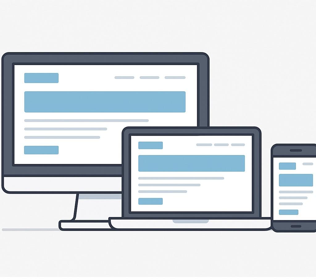
Generated with artificial intelligence
The Fundamental Principle of Responsive Design
Definition(s) | Responsive web interface design based on screen size | ||||||||
|---|---|---|---|---|---|---|---|---|---|
First Use | 2010 | ||||||||
Main Technologies | HTML, CSS (Flexbox, Grid), Media Queries | ||||||||
Pioneer | Ethan Marcotte | ||||||||
Advantage(s) | Compatibility between mobile and desktop with a single codebase | ||||||||
Responsive design is an approach to designing websites and applications so they adapt to different screen sizes and devices. Interfaces created using this method provide a user-friendly appearance on all devices, from desktop computers to smartphones. Responsive design has become the standard in modern web development for enhancing user experience and facilitating content access across various devices.
The prominent features of responsive design are as follows:
Responsive design is now the preferred method for the majority of websites today.
Company websites are designed responsively to allow visitors to access them from any device.
The growing number of mobile users has made responsive design essential on e-commerce platforms.
Various libraries and frameworks are utilized in the responsive design process:
Marcotte, Ethan. “Responsive Web Design.” A List Apart, May 25, 2010. Accessed August 1, 2025. https://alistapart.com/article/responsive-web-design/
Mozilla Developer Network (MDN). *Responsive Design Basics.* Accessed August 1, 2025. https://developer.mozilla.org/en-US/docs/Learn_web_development/Core/CSS_layout/Responsive_Design
W3C. Media Queries Level 4. Last updated: June 2020. Accessed August 1, 2025. https://www.w3.org/TR/mediaqueries-4/

Generated with artificial intelligence
The Fundamental Principle of Responsive Design
Definition(s) | Responsive web interface design based on screen size | ||||||||
|---|---|---|---|---|---|---|---|---|---|
First Use | 2010 | ||||||||
Main Technologies | HTML, CSS (Flexbox, Grid), Media Queries | ||||||||
Pioneer | Ethan Marcotte | ||||||||
Advantage(s) | Compatibility between mobile and desktop with a single codebase | ||||||||
Key Features
Applications
Corporate Websites
E-Commerce Websites
Tools and Technologies